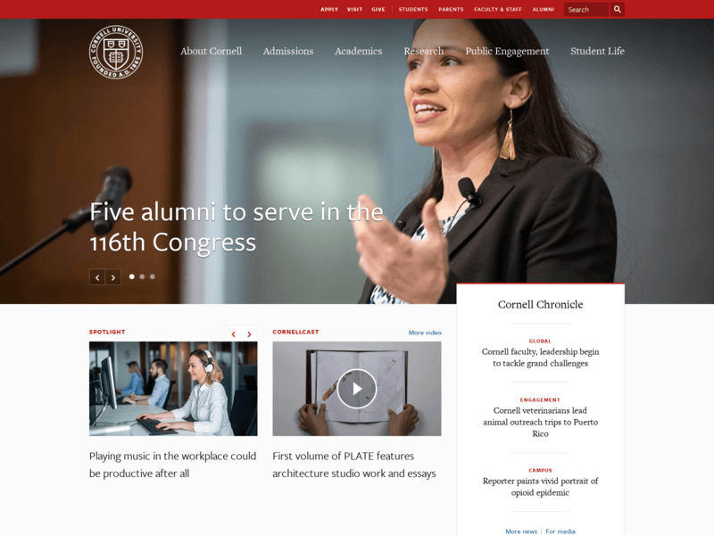
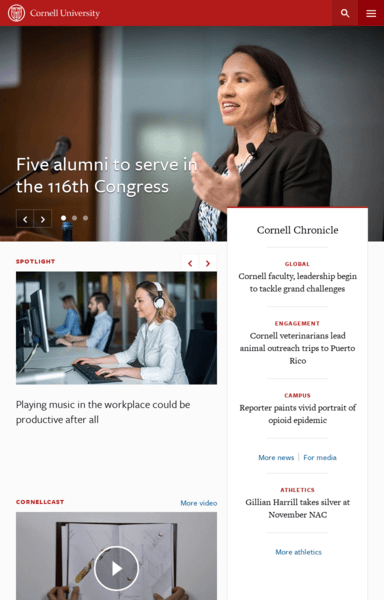
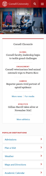
The name of this website is Cornell University. The target audience for this website is college students seeking to attend or who want to attend this university. This website uses a responsive web design where the screen fits onto different screens of different devices such as a desktop site, a tablet device and a smartphone device. Some similarities between the different designs would be they all have the same content, and menu options. Some differences would be the way the navigation bar is set up. The tablet and smartphone both have a menu tab you press on and it gives you a list of the different pages to go to, while the desktop has a navigation bar with the different tabs to choose. One way the display has been modified is the way the background picture looks. The background picture on the desktop is the main focus on the screen, while on the tablet and smartphone, because the screen is condensed, the user can see the picture and all the info. Another way the display has been modified is the tablet and desktop both have videos on the main page you can click on, while the smartphone doesn’t.
The website does meet the needs of the target audience in all three devices. All the information is covered in all three devices, just displayed a little differently. One way the website could be improved is if they changed the font color so it’s easier to read against some of the pictures. Another improvement could be to keep the drop-down menu’s design consistent. Lastly, place more important information first when the user is scrolling.
 Alyssa's Web Design Blog